What I learned as an intern at Uber

1. Seek out responsibilities that you’re not quite qualified for.
Uber treats its interns like full-time employees; we’re given more creative freedom and control than we probably deserve. The company is too young to create trivial intern assignments that don’t contribute to the core business.
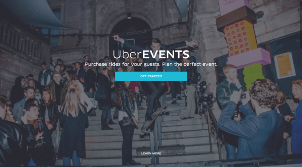
One of my projects, for example, was UberEvents—a service that allows event organizers to buy rides for their guests. The idea for Events came from two leads on my team who were convinced that pre-paid rides were a big, untapped opportunity for Uber. They rented a house on a whim and recruited a small, cross-functional team to help them bring their idea to life over a June weekend. In an unlikely turn of events, none of the other designers on my team were able to attend the weekend work-cation. And to my surprise, no one stopped me from becoming the temporary lead designer on UberEvents.
I’m not sure how the product manager initially felt about my three-day stint as a design lead, but he and the team were fired up when we launched Events to the world. It turned out to be quite a hit. (And Inc. Magazine even wrote about “how a rogue team secretly built Uber’s latest project over a weekend.”) I got the chance to learn from a talented group of engineers, marketers, and biz dev folks because I said yes to an opportunity I didn’t feel perfectly prepared for.

2. Great product designers think like scientists.
User-centered design is a descendent of the good ol’ scientific method. It’s a continuous cycle of questioning, researching, hypothesizing, testing, and iterating. A design is a hypothesis made visual—your best guess as to how a piece of software should behave and how a user will interact with it. It needs to be tested before you can know if it’s right. You’ll eventually lose credibility if you justify design decisions by appealing to trendy, abstract concepts like “delight.”
Designers love to talk about the value of having empathy for users, but it’s also important to have empathy for people who don’t immediately see the connection between good design and the bottom line. When your team is strapped for time or engineering resources, superfluous design will often be the first thing to go. A good way to earn the trust of your coworkers is to avoid arbitrary decisions and back up design solutions with solid research. You should always be able to explain how your decisions will impact user behavior and move the metrics that matter.
Design research doesn’t have to be process heavy or resource intensive. A little bit of prototyping and usability testing can go a really long way. As much as we like to think we’re our own worst critics, the truth is that we’re incapable of judging our own work objectively. Take care to document the logic behind your most important decisions. Product life-cycles are long, and memories are short. Future designers and product managers shouldn’t have to rehash old debates just because you were too lazy to explain yourself.
3. People will take you seriously no matter how young you are.
I was consistently surprised by how much access I had to the higher-ups at Uber. But the even crazier thing was that they listened to what I, a 20-year-old intern, had to say. A lot of tech companies pay lip service to the cliché that the best idea should win no matter who it comes from. But I always felt that was true at Uber. During my time there, I was surrounded by people — no matter how senior — who were willing to debate me and take my opinions seriously.
4. The cutting-edge is controversial, but that’s what makes it compelling.
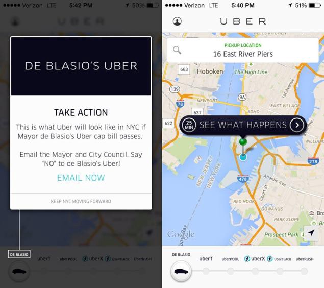
Halfway into my summer at Uber, Mayor Bill DeBlasio of New York City announced his plan to cap Uber’s growth at 1% per year. It was fascinating to watch Uber’s political apparatus kick into gear. Uber is one of the only tech companies that can be said to have a constituency (not merely a user base). On the grassroots level, my friends on the communications team were mobilizing passionate riders to fight back against DeBlasio’s proposal. At the executive level, David Plouffe — Obama’s former campaign manager — was meeting with key stakeholders in NYC. Uber launched its first-ever political TV ads. Graphic designers created a full-page ad for the New York Times and a clever protest in the mobile app. The CEO answered strategy questions at his weekly company-wide Q&A.

This sort of political battle is, of course, nothing new for Uber. The company has been a controversy magnet for the entirety of its 5 short years in existence. Most people either hate it or love it, and almost everyone has an opinion. Intentional or not, working at Uber is a bit of a political statement. You can’t escape the politics that surround the company, and you’re often asked to defend its tactics. The cutting-edge has always been, and always will be, controversial. But that’s part of what makes working at Uber so intellectually stimulating. It’s the lovechild of a tech startup and a political campaign. The company has been so successful in part because the people who work there aren’t afraid of stirring up a little controversy.
5. Great designers speak (and understand) the language of the engineering team.
Before working at Uber, I was under the impression that designers interact with engineers only at the end of the design process — after the mockups are pixel perfect.
Wrong. Engineers at Uber work closely with designers early and often. The engineering team taught me how important it is to understand the technical constraints of a project and to get buy-in from the people who will ultimately build out your designs. The product development process is a constant series of tradeoffs between time, engineering resources, and design quality. If you’re familiar with the technical side of things, you’ll be better equipped to make intelligent tradeoffs and more likely to orchestrate a smooth transition from design to engineering.
Always experiment with new ways to communicate your intentions to engineers. They’ll thank you, and the products you ship will be all the better for it.
6. There’s a lot more going on behind the scenes than you could ever imagine.
A lot of people make the mistake of thinking that there’s not much left to design at Uber. They think the product is more or less finished. But its consumer-facing simplicity hides the complexity under the hood that makes everything work smoothly. The rider app is just the tip of the iceberg. Many users are surprised to discover that the driver app is a completely different and far more complicated product. Drivers use it to manage earnings, goals, ratings, feedback, dispatches, and directions.
It’s no secret that Uber’s ambitions extend far beyond the driver and rider apps. The company wants to become the global logistics platform of the future. There’s UberEats, UberRush, Uber for Business, UberEvents, UberCommute, UberHop, the third party developer platform, plus a lot more in the pipeline. That said, the core Uber app is nowhere near perfect or finished. Designers at Uber (and elsewhere) are perpetually dissatisfied with the status quo. They’re obsessed with the challenge of making things better, more efficient, more intuitive. How can we create a better rating system for drivers? How can we improve the experience of riding with strangers on UberPool? How can we make Uber more accessible for the elderly and people with disabilities?
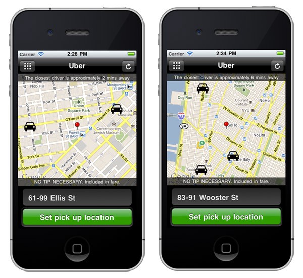
Here’s what Uber looked like only four years ago:

No UberX or UberPool. No ETAs. No destination entry. The Uber of today will probably look and feel just as primitive in four years’ time. If Travis Kalanick has his way, owning a car will one day be like owning a horse — fun for the wealthy, but financially foolish for everyone else. We’ve got a ways to go, but I like to think that the road to the future is paved with thought-provoking design challenges.