Fools and their time metaphors

We need to talk about the way we talk about time. Calendar apps were supposed to make us feel at peace and in control. Instead, we’re scatter-brained, stressed, and over-booked. First we shaped our calendar tools, and thereafter our calendar tools shaped us. I want to investigate the problems they’ve created and propose a way out. Let’s start by breathing some life into the “zombie metaphors” that haunt our daily conversations about calendars and time.
Dead Metaphors
Let me “throw some time” on your calendar. Time is a dart, the calendar is a dartboard. Time is a baseball, the calendar is a catcher’s mitt. Time is a magnet, the calendar is a refrigerator. Time is an object that, when thrown, can stick a landing.
Let’s “grab some time”. Time is a basket full of apples. You reach in, grab a few, and put them on the table so that you and your teammate can partake together.
Let me “put some time” on your calendar. Time is butter, paint, glue, salad dressing. You rub it, pour it, place it, spread it onto the (previously empty) surface of your teammate’s calendar.
Let’s “set up some time”. Time is a deconstructed IKEA couch that just arrived in the mail, waiting to be assembled. You and your teammate put it together and take a seat when it’s all set up.
Let me “find some time” on your calendar. Time is a hidden treasure, buried underneath a pile of garbage. You dig and dig and dig until you finally uncover what you were looking for—a sliver of unclaimed time, a needle in the haystack.
I’ll try to “squeeze in some time” for you. Time is toothpaste, stuck in the worn-out toothpaste bottle of your calendar. You’re rolling up the bottle from the backend, hoping to push the last little bit of minty Crest into the light.
These metaphors make it hard for us to think of time as something to protect, care for, or cultivate. Instead, we’re always throwing time around, squeezing it, grabbing it, killing it. We’re at a loss for time, and we never feel like there’s enough of it. Time-to-yourself is often the exception rather than the rule.
The original sin
I think our calendar apps deserve some of the blame for this problem. They reenforce bad habits of mind and amplify behaviors that are stressing us out. Digital calendars matter because they mediate our understanding of time in both professional and social contexts. We usually don’t think twice about the design of these tools because they’re the invisible “water we swim in.” But their default settings/visualizations are shaping how we treat our time and others'—for the worse.
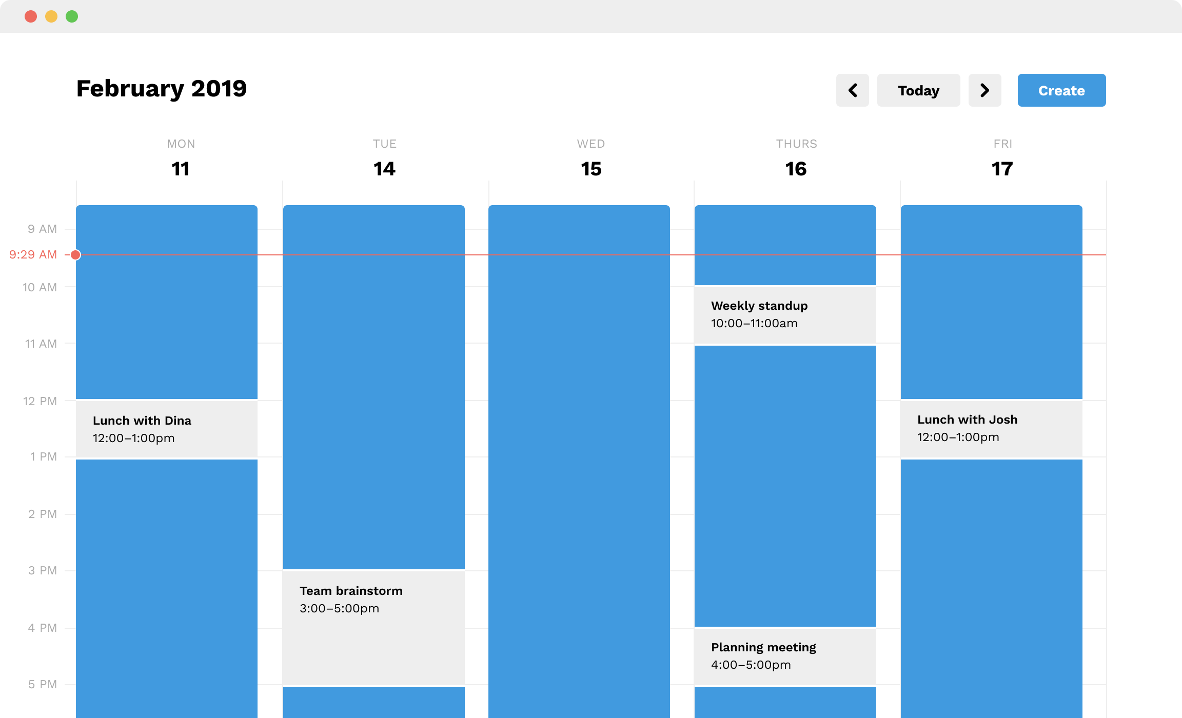
The original sin of digital calendars is that they’re blank by default. All white. Waiting to be “colored in” with the events of your life. The blank-by-default style of representing time implies that your time is not accounted for. Empty wasteland. Nothing to see here. This is an especially bad default in the corporate world, where Gcal has turned private calendars into a shared commons. Anyone can easily pull up your schedule, and the blankness-by-default is an open invitation to take away your time. (My mom was particularly surprised to learn that tech workers often don’t use their words to set up meetings. They just “throw time” on the calendar and wait for an RSVP.) We’ve increased transparency and enabled more collaboration, but we’ve lost our respect for other people’s time. And we somehow find ourselves using calendars that imply our time is not our own.
Digital calendars misrepresent the default state of your time. It’s far from empty. You’re working, thinking, talking, problem-solving, Being. Blankness shouldn’t be an invitation to interrupt. It’s yours, it’s sacred! But when someone sets up a meeting with you, the calendar app never makes them feel like they’re taking something away from you. The UX is additive, rather than reductive. We’re always “putting time on” calendars, never “taking it off.”
Escaping the Gregorian grid
Let’s imagine what a calendar would look like if it were designed to help people respect your time. Perhaps it’s as simple as inverting the visual system so that your time is represented as “taken” by default. Other people’s meetings (OPM, pronounced “opium”) show up as intrusions on your time, carved out from a colorful block that is decidedly not an empty wasteland.

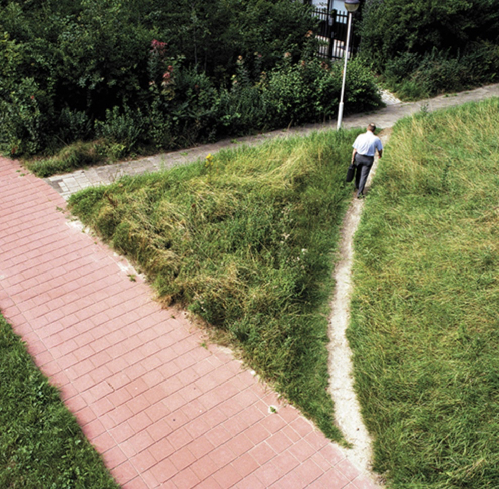
Poorly designed calendar apps have provoked a lot of strange new behaviors. At Uber, I knew a lot of people who started creating “time barriers” for themselves. They’d block off big chunks of time with events that said “DNB” (Do Not Book). Some particularly desperate people would invent fake events and strategically place them throughout the day, making it difficult for would-be time thieves to find enough “empty” time. These protective mechanisms are band-aids. They’re what designers call desire paths or free-will ways: “paths and tracks made over time by the wishes and feet of walkers, especially those paths that run contrary to design or planning.” In other words, an unexpected behavior that emerges as the result of poor design. See: the picture at the top of this post.
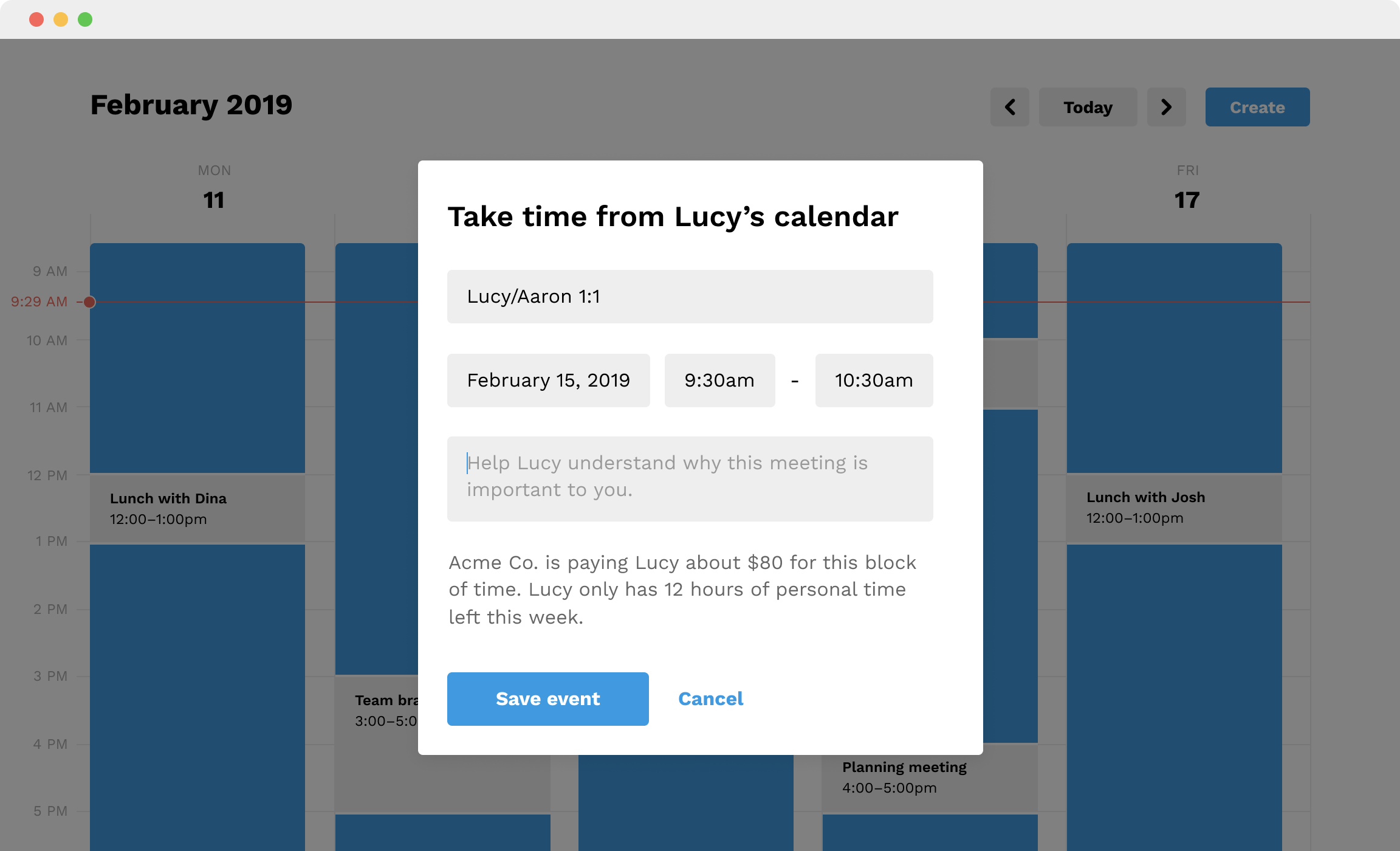
People are actively fighting against UI defaults, trying and failing to guard the time that’s supposed to be theirs. The interface is currently working against them, but what would it look like if it were trying to help them instead? Maybe when someone tries to “set up” time with you, the calendar (gently) reminds them that they’re actually “taking time” away from you. Maybe they’ll see a little note that tells them how much personal time you have left this week. These subtle interventions could go a long way towards preserving people’s time and sanity.
Of course, all of this assumes that we need a software tool to middleman our IRL interactions. I’m not convinced, but to suggest otherwise is basically heresy (at least in the tech industry).

Beyond these simple fixes, I suspect there are some weirder solutions yet to be explored. Our current calendar interfaces lean too heavily on dead-tree methods of representing time. What if a calendar could represent subjective time (i.e. how long a meeting feels, its tempo/energy, its emotional valence, etc.) Some events fly by because they feel productive and fun. Flow states abound. The boring and dull events drag on forever. But on the calendar, these two types of events look exactly the same. The subjective quality of time—how it feels from the inside—is missing entirely. If the idea of a “subjective calendar” sounds too far-out, consider the alternative maps made by creative cartographers. They add new meaning by distorting conventional representations of geography. Why can’t our calendars follow suit?
A new app called Spase is just starting to scratch the surface of what’s possible here. Built by Sahil Gupta, it’s a calendar that represents time as three-dimensional space. It feels more like a video game than a calendar. You can “fly” around the weeks and months, zooming in and out as you navigate the landscape of your time. Check it out:
Once we escape the 2D Gregorian-grid prison, we can visualize time as a stream we’re floating in, a viscous fluid we’re wading through, a path, a memory palace of our own design. So what? If our current ways of representing and thinking about time are causing us so much anxiety, we might as well go back to basics. When we question the assumptions that are built into our tools, we can think more clearly about how they’re influencing us and how we can make them better. Now’s the time!
If you have comments or questions about this post, please drop them here. You might also like The garden of forking memes — my essay about how digital media is distorting our sense of time.
Endnotes
The title of this post is inspired by a Ribbonfarm essay called Fools and their money metaphors—a close look at the metaphors we use when we talk/think about money.
A quote from a Breaking Smart article about Bergsonian Stream Time, which questions the typical “past = locked, future = open” dichotomy:
Bergsonian time … is an altogether different beast. Think of it as being more like a memory-bookkeeping understanding of time that puts subjective time ahead of objective time, kairos ahead of chronos. The past is not necessarily fully locked down, and the future is not necessarily fully open. Unpaid bills/invoices and active contracts that constrain the future are more hard-edged examples of what I mean. In experienced time, the past, present, and future interact in the form of complex settling memories within which promises, debts, commitments, and intentions all evolve together, sort of like a blockchain. The present is already memory as it is being experienced, and if there are keys, they are spread out across a window of active, unsettled events with potentialities. Perhaps a better term for Bergsonian time is an abstract sort of roiling potential energy.
Clockwise is an interesting “calendar assistant for teams.” It’s enterprise software, but the creators have some really novel ideas about how to better protect people’s time. For example, the tool helps managers see how much “focus time” their team has each week. When you set up a meeting, it warns you if you’re creating a lot of fragmented time for your coworkers.