Design as (un)ethical illusion
“And then came the grandest idea of all! We actually made a map of the country, on the scale of a mile to the mile!”
“Have you used it much?” I enquired.
“It has never been spread out, yet,” said Mein Herr: “the farmers objected: they said it would cover the whole country, and shut out the sunlight! So we now use the country itself, as its own map, and I assure you it does nearly as well.”
—Lewis Carroll, Sylvie and Bruno Concluded
When my thermostat broke last year, I got to see what it looks like naked and exposed.
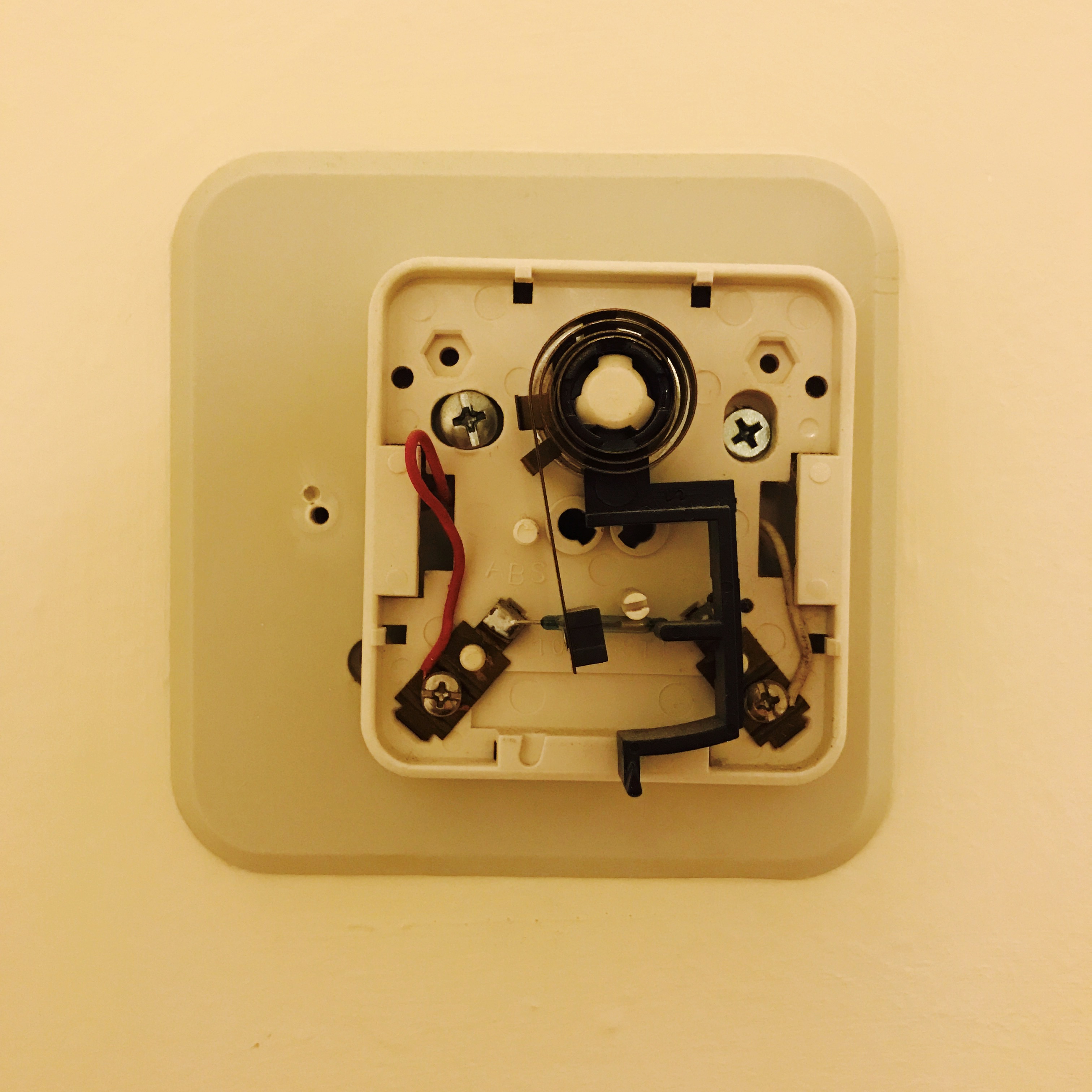
It’s an extremely messy world of screws and wires and levers and switches. I have no idea how I’d use it to control the temperature in my apartment. With a little bit of luck and a lot of finagling, I was able to put it back together. Here’s the thermostat in all its perfectly functional glory.
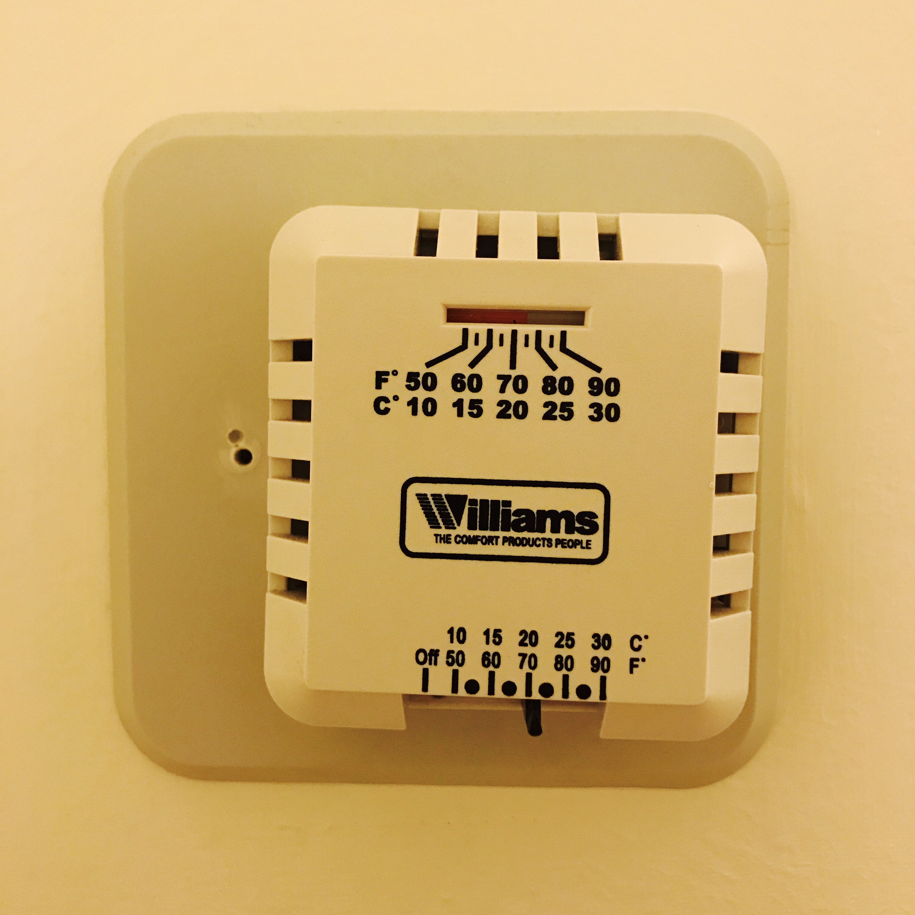
Thanks to the (inter)face, I can read the temperature, blast the heat, cool it down, turn it off. The face is a map that obscures the complexity of the territory underneath. It imposes the illusion of simplicity on the messiness that’s below the surface. It hides the “truth” about how the system looks and works in order to make it easy for me to use.
This sort of abstraction and obfuscation is core to how we navigate our physical world. All maps are lies. Useful lies, but lies all the same. They don’t tell you everything about the territory. If they did, they’d be totally useless and impossible to read. Maps show you a highly simplified model of the territory—an incomplete version of the truth based on your goals, context, zoom level, location, etc. They’re helpful because they leave stuff out.
Maps and thermostats are just two examples of systems that obscure complexity for the sake of usability. Let’s explore a few more:
Writing. Writers don’t publish their raw notes and scratchpads and transcripts. They publish a polished piece. The final product obscures the messiness of the creation process.
User interfaces. Computer screens hide the complexity of the circuit board that makes it all work. Deep down, it’s all 1’s and 0’s. But you’d have no idea how to accomplish anything with your computer if you had to interact directly with the wires and the CPU. There aren’t actually files, desktops, trash cans, or windows inside your computer—these are metaphors borrowed from the real world to help you interface with your impossibly complex machine. Similarly, your light switches obscure the complexity of your home’s electrical wiring system. You don’t have to know how it works, you just have to know how to turn a switch on/off.
Conversation. When your coworker asks you about your weekend, they don’t really want to know exactly what time you woke up, which sock you put on first, what time you went to the bathroom. The only way to communicate effectively is to leave out a lot of detail. When you tell them a crazy story about your Saturday night, you’re hiding all the other little facts about your weekend. You’re giving them the map, not the territory.
Grocery shopping. When you go to the supermarket, you see a bunch of meat neatly packaged on the shelves. Food companies obscure the means of production. It’s best you don’t know all the messy details about what happened to those animals before they ended up in the store. The territory might make you afraid of the map.
Trading off truth
The more you expose about the inner workings of a system, the harder it is to interact with it. Nobody wants to watch their meat get slaughtered. Nobody wants to control their computer with the circuit board. Nobody wants to hear every last detail about your weekend.
But there’s always a tradeoff between complexity, truth, and control. The more details are hidden, the harder it is to understand how the system actually works. (And the harder it is to control). The map becomes less and less representative of the territory. We often trade completeness and control for simplicity. We’d rather have a map that’s easy to navigate than a map that shows us every single detail about the territory. We’d rather have a simple user interface than an infinitely flexible one that exposes a bunch of switches and settings. We don’t want to have to think too hard. We just want to get where we’re going.
In a world of hidden complexities, the most important resource is trust. We have to trust the designers and gatekeepers who are shielding us from the messy details. We have to trust that their maps are truly representative of the territory because we can’t know everything about how everything works.
We’re blind to the ubiquity of trust because it’s the water that we swim in. Consider my thermostat. An evil designer could have printed the temperature scale backwards, so that the apartment gets colder when I tell it to get warmer. This maniacal prank wouldn’t last very long because I’d figure out that the thermostat’s interface is a lie. The map misrepresents the territory, but the evil designer can’t do much damage because I’d experience this mismatch firsthand. I’ll realize something’s wrong when my apartment feels like a sauna after I turned the heat down. Eventually, I’d learn how to use the map “incorrectly” in order to get what I want (i.e. slide the thermostat’s needle toward the hot temperatures when I want it to get colder).
Deceptive design
Unfortunately, most complex systems aren’t much like my apartment because they don’t have tight feedback loops. We don’t always know when the maps are misrepresenting the territory because the territory is hidden from view, and we can’t experience it firsthand. In this way, complexity creates power through information asymmetries. If I don’t know how your system really works, I’m completely dependent on you to tell me what’s going on under the hood. I have to trust that your trail map isn’t going to lead me off a cliff.
Many, if not all, of our world’s most wicked problems are rooted in the excessive hiding of complexity behind illusions of simplicity—the relentless shielding of messy details in favor of easy-to-use interfaces.
We produce a massive amount of waste and pollution through consumption, but all of our trash is swiftly taken away by waste management companies that conveniently hide it from view. The trash can on the sidewalk is the “interface” that shields us from the landfill.
We give a massive amount of data about our lives to advertising companies like Facebook and YouTube. These internet platforms hide their massive surveillance project beneath a friendly user interface and a brand message that’s all about “democratizing communication” and making the world more open and connected. They make us think that we’re sharing content in order to connect with our friends. In truth, they want us to share content so that they can build more accurate ad targeting models. We think we’re lowering the temperature, but we’re actually turning on the sauna.
Sometimes, we experience moments of reckoning. We realize that the thermostat is misrepresenting the actual temperature of the room. Facebook users, for instance, experienced a reckoning of sorts last week with the revelations about Cambridge Analytica—a data collection firm that illegally stored information about 50 million users and their connections. For the past 12 years, Facebook has largely been able to maintain the illusion that it’s merely a platform for connecting with friends. That illusion has been broken, if only temporarily. The messy details of privacy invasion and political manipulation were exposed. The question is whether trust in the mapmaker can be restored now that we know the territory is not what they had us believe. (And whether people really care at all that their previous map was designed to be misleading).
Towards more ethical illusions
Now we can begin to construct a system of ethics for designing the interfaces to complex systems. (I’m using the term “interface” in a broad sense of the term—trash cans, light switches, storefronts, apps. Anything that mediates our interaction with messy underlying structures). Designers who strive to create ethically must care about a few core questions:
- How can we create maps that are roughly representative of the territory—incomplete but useful truths, rather than misleading lies?
- How can we reshape territories to more accurately reflect our idealized maps?
- How can we expose complex truths without creating confusion and apathy?
Ethical design is like a glove. It obscures the underlying structure (i.e. your hand) but preserves some truth about its shape and how it works. Deceptive design is like a mitten. It obscures the underlying structure and also hides a lot about its shape and how it works. If you’re an alien trying to figure out how human hands really work, a glove will at least hint at the hidden complexity of fingers, thumbs, clasping, etc. Mittens, on the other hand, will make the alien think that human hands are useless, fingerless blobs of flesh. Glove design is the thermostat that works correctly, the social media interface that’s transparent about the data you’re leaking, the food system that makes you aware of where your meats are coming from.
The map can never be a perfect representation of the territory. If it were, we’d end up like the silly character in Lewis Carroll’s story. But we should strive towards creating gloves, not mittens—maps that accurately reflect the territories and help people navigate to where they want to go.
Thanks to Tania Anaissie for inspiring and contributing to these ideas.